Super Fitness
Your fitness journey starts … NOW!


Overview:
Super Fitness is an app where users choose their own personal coach to help them achieve their fitness goals.
To be successful in creating this app, I needed to understand the problems people were having with their fitness journey. Most people want to believe there’s a magic pill, a secret diet plan, or that they simply don’t have enough time. Well the truth is, we all have our reasons why reaching our fitness goal is impossible and most of them are just excuses. There is a deeper reason why people don’t reach their goals. Is it motivation? No guidance as a newbie? Unclear goals for beasting it up? Perhaps, their results have plateaued and couldn’t get any more gains?
The answers were not found using bro science. This is the story of how I found out.
My Role:
This project took place between July 2020 and February 2021. As the lead researcher and designer of this project, I conducted user research, usability testing, and interviews. I was also in charge of the design by utilizing UX strategy, interaction design, prototyping and UI design.
The Process:
Discovery: The Research Phase
Understanding the Problem:
Fitness looks very simple from the outside (gym and salads = results, right?) but it is actually very complex. I started by digging into the possibility of problems individuals may have to set the foundation of our product.
Let’s be honest, “fitness” has an overwhelming amount of information and it is especially hard for those who are new to fitness and dieting. With so many routines targeting different areas, various diet plans, and hundreds of websites with the secret formula, how would anyone starting out know where to begin? If there is a strong lack of accountability and motivation, it can discourage individuals who are new to fitness and diet. On the other hand, experienced people need to change up their routines to avoid hitting a plateau.
Our users need a way to quickly find expert advice or information that fits their personal needs.
My goal was to create a product that users can use to match with the best Coach for them to receive quality, personal advice. I need to create a feature that will allow users to connect to a personal Coach. In addition, users can quickly access expertly picked workout routines, meals, and articles that accommodate to their fitness goal.
I conducted a Competitive Analysis to gain strategic insights into the strengths and weaknesses of competitors in the market.
I began the research process by performing Competitive Analysis for 2 popular fitness apps, Myfitnesspal and Nike Training Club.
This step in the process was particularly important because I needed to understand the competition but at the same time find opportunities to be different. I needed to discover what strengths other apps had that made them successful and how it can help inspire my app to be successful.
SWOT (Myfitnesspal)
Myfitnesspal Analysis
I learned that Myfitnesspal does not have 1-on-1 coaching and accountability which is one of the main features of our product. Users will be able to connect to their Coach via video call.
SWOT (Nike Training Club)
Nike Training Club (NTC) Analysis
I learned that NTC does not have a community or profile personalization which are accountability features. Having friends and being a part of a culture of fitness pushes individuals.
Let’s find out about our target audience.
After performing the competitive analysis, I knew this sector of apps had a large target audience so I wanted to find out which groups I should target - beginners, intermediates, or experts. I needed to figure out who the users of the app would be so I conducted User Interviews on 4 people.
Who is the User?
User interviews were conducted to figure out information on their motivations, frustrations, and goals. With those answers in mind, they were asked what apps they use and their favorite features of the app.
“Its free. Very basic and color decodes what to do. Nice visual and clear and simple to use.” - Green
This told me how my app could answer their problems and help them reach their goals. Similarly, they were asked which features they disliked about the app they were using.
“Some exercises require equipment, so I had to go buy resistant bands, bouncy ball, tennis balls and a yoga mat.” - Chuck
Preferences were identified and analyzed, which I used to brainstorm features of my product. Interesting things I learned from the interviews were that they found the most motivation from their own results and from having accountability from their friends.
“[My motivation is] to keep the gains going. You start seeing changes and it would be a shame to fall back.”
- Barry“Motivation is accountability from crowds from those classes and taking friends to go with me to gym.”
-Green

Affinity Mapping: Making sense of our user’s thoughts.
With the information I gathered from the User Interviews, I analyzed the results by creating an Affinity Map. It was difficult to sort some responses as they could have fit in other categories. For example, “having a routine” and “being on a strict diet” would fit in the Lifestyle category but I put them in the Purpose category because of the question, how they responded, and seeing their nonverbals.
I categorized similar patterns and themes from the interviewees responses. Doing so allowed me to analyze the categories to determine specific pain points they were having with their apps and goals. Ultimately, User Personas were created to get an idea of my target audience.
Each color represents a different user.
Define: Creating the Target Audience
The Ambitious and the Coach
After gathering data from the interviews, 2 user personas were created to portray the target audience and 1 proto persona portrayed a Coach. The goal here was to be able to showcase all users of the product, including Coaches. Since I did not know a personal fitness coach personally, I couldn’t gather information in the research phase. Instead, I created a Proto-persona in addition to the 2 user personas.


Ideate: Product and Human Interaction
Journey Maps & User Flows:
Now that I had my User Personas created, it gave me a better idea of my target audience to work with. The next move was to answer the following questions: How would my users navigate my product? How would they be be able to use the features to complete their tasks? To better understand the level of user empathy, a mental model was created.
Goal:
To understand how a person accomplishes their fitness goal.
How my app should be designed to fit user behaviors, thoughts, and feelings.
The information was used to create user journey maps and user flows of our user personas. Performing this step of the process allowed me to get into the mind of the user and see how they would complete a given task. It helped fill gaps in the navigation which proved to be crucial in the next step - Card Sorting.


Card Sorting:
After user flows and journey maps for personas were created, a card sorting was conducted. I had a hard time deciding where to put the Daily Tasks feature because it could apply to both My Plans and Profile. In the end, it made more sense to put it under My Plans because the user wants to see their goals which included completing their daily tasks. Users had a lot of trouble sorting Calendar because it is a generic function that could be applied in multiple categories.
The main pattern I saw in the responses were that many things that applied specifically to the user’s journey (my meals, my plans, my progress, etc), the participants grouped them in to one. Whereas, things that had to do with the user’s personal info were it’s own category separate from the user’s journey. Similarly, anything that had to do with a group or community, the user would also separate. It was interesting to see what the participants grouped differently from each other and it would be a good challenge to try and incorporate their ideas into my sitemap.
Wireframes:
After conducting user research, I was ready to begin drafting the key user flows using low-fidelity wireframes. The aim was to keep the app as simple and up-front as much as possible. Some inspiration came from popular fitness apps in the market.
After low-fidelity wireframes were created, I moved on to the mid-fidelity versions to include the smaller details before I moved on to high fidelity wireframes.
Goal:
Use the sitemaps created earlier and apply them to the design of the app
Get an idea of the design and lay down the basic structure.
Increase detail in mid-fid and High-fid.
Get ready for Usability Testing. (DUN DUN DUN)
Low-Fidelity Wireframes
Mid-Fidelity Wireframes
Prototype: User, let me introduce you to my friend, Product.
High-Fidelity Wireframes
Usability Testing:
Once the high fidelity wireframes were complete. It was GAME TIME. I conducted 2 kinds of usability testing, moderated in-person and remote testing. A total of 6 people were tested.
Goal:
See where the usability of the product failed.
Ask myself and the user why errors happened.
Get caffeine for a long night of the design iteration process.
This step in the process was the game changer for my fitness app. It was very exciting part of the process as many errors were made and exposed the flaws in my design. The biggest issue was that the ‘search’ in the tab bar was not intuitive enough to let the user know that is where to go to find exercises, meals, and articles. User’s were trying to click on articles on the home page. Users also had a hard time finding the ‘filter’ icon.
I observed and recorded notes of user’s comments, nonverbals, and signs of pain points. I analyzed this information by creating an affinity map and translating the information onto a rainbow spreadsheet and severity matrix. The app was revised to make the app for intuitive for users.
Severity Matrix
The Severity Matrix ranks errors in the category of consequence severity (1 = high severity, 5 = lowest severity).
Originally, a rainbow spreadsheet was created but it looked very complicated so I made a severity matrix also. This is a much simpler approach to see the errors and identify the severity of error risks made by users. Errors ranked high and color coded in red were addressed immediately.
Error : The ‘search’ in the tab bar was not intuitive enough to let the user know that is where to go to find exercises, meals, and articles. User’s were trying to click on articles on the home page.
Suggested Change: Add coaching tips when the user reaches the Home screen after onboarding
Evidence: To give the user a quick guide on how to navigate the app
Error: The filter icon was not noticeable when the participants were directed to refine their search.
Suggested Change: Add the word “Filter” next to the icon
Evidence: There is no universal ‘filter’ icon. Adding the word will be more direct.
Error: Clicked on ‘Message Coach’ from the Request screen because the next task was to schedule a video call. '
Suggested change: Add pop-up screen after sending request to let the user know they must wait for the Coach to approve request before they can schedule meetings.
Evidence: lets the user know their options after a request is sent.
Typography & Color Pattern:
UI Patterns & Styles:
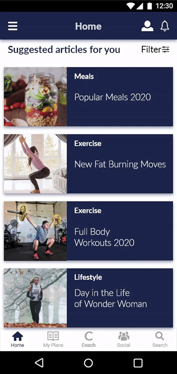
Final Prototype:
After the revisions were made and the design was finalized, a few touchups were done to make the app more aesthetically pleasing for users. Inspiration from Material.co were also applied to the design. During this stage, crucial Gestalt Principles and Color Theories were implemented. The most difficult part of this stage (other than trying to find a Galaxy S10 mockup) was deciding how much usability testing I should continue doing to ensure the final prototype was working well and met the user’s needs.

Reflection: Final Thoughts.
This project was very fun and a great learning experience. A lot of time was spent learning how to research and not just doing researching in general. I believe that is what made this product successful. The biggest thing I learned was how different user’s minds operate even though I am a user myself of similar apps. The ability to really understand and empathize with users is crucial and it’s an awesome feeling knowing that the user is happy. Ultimately, it comes down to meeting the user’s needs.
Going forward, completing the rest of the screens and going through the process again is required before handing the product off the the developers.